Slide Shows That Rock The Casbah!
If your slide shows have lost their mojo, then this blog post is for you! Unfortunately, we fall victim to bad slide shows on a regular basis, and I’ve concluded that this lack of inspiration leads us to create dull slide shows of our own. Of course, my theory is completely unfounded and it’s something I concocted on the spot, yet being inspired wouldn’t necessarily be a bad thing, right?
Anyway, here are a few inspirational slide shows that will hopefully spark some creativity in your next design and get you thinking outside the slide!
How To Make A Tangible Product In Phoenix by Dean Heckler
Dean is a technical consultant and software designer, and in his spare time he runs Heckler Design which creates awesome products like the OneLessDesk. Dean’s presentation is actually 95% text, so what stands out the most is how he avoids bulleted lists and uses color to emphasize certain words. This particular presentation was given at the October 29th, 2008 Ignite Phoenix #2 event and you can watch a video of the presentation by clicking here.
- Presentation Software: Apple’s iWork Keynote
- Presentation Font: Helvetica Neue (Condensed Bold)
Surviving Your Commute by Daniel Davis
Daniel Davis of Steam Crow is a local Phoenix illustrator and designer. In 2008, he launched a daily web comic called the “Monster Commute†which chronicles life on an endless monster freeway; you can view his comic by visiting http://steamcrow.com and you can watch video of the presentation by clicking here.
- Presentation Software: PDF via Adobe Illustrator and InDesign
Changing the way we look at things by Brian Shaler
Brian Shaler is a Flash Developer who experiments with data visualization and interactive interfaces to find new ways for people to interact with data. This presentation, along with the previous two, was given at the October Ignite Phoenix event and you can watch a video of the presentation by clicking here. What I like about Brian’s presentation is the use of online tools to convey his ideas, which is something anyone can do if they feel that a standard chart is too dull.
- Presentation Software: PDF via Adobe Photoshop
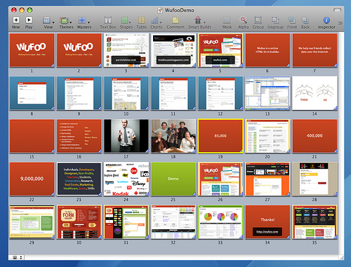
Wufoo Demo by Wufoo.com
I’ve actually mentioned Wufoo on this blog several times in the past and really like this recent slide show they put together. What stands out the most is 1) how nicely they integrated their company branding into their slides, 2) their abundant use of eye catching colors, and 3) their simple text slides. I also like how they used color to differentiate various terms in slide 22.
- Presentation Software: Apple’s iWork Keynote
Educating clients to say yes by Paul Boag
Paul Boag is the co-founder and creative director at Headscape; he also speaks regularly on web design and hosts the longest running and most popular web design podcast over at boagworld.com. This slide show was part of his presentation given at the 2008 Future of Web Design event and you can watch the video from his presentation here.
- Presentation Software: Apple’s iWork Keynote
In Conclusion…
This is by no means a complete list of all the great slide shows out there, but they caught my eye since they’re simple and effective. Now it’s time to hear from you, what great slide shows have you seen and why do you enjoy them? Feel free to leave your answer in the comments below.
Sincerely,
The Closet Entrepreneur
» This entry was filed under Presentations and tagged with: Inspiration, keynote, powerpoint, Presentations


Start The Conversation
Leave a Comment