Some Comments About the iPhone Unveiling Presentation
I apologize if the title is a bit misleading; this post is about the actual presentation that was given by Steve Jobs, and not the iPhone itself… if that makes any sense?
Would I be brash in proclaiming that Steve Jobs is to presentations what Micheal Jordan is to the game of basketball? I mean the guy has completely rewritten the rules when it comes to creating and delivering a presentation. Gone are slides chocked full of text and bulleted lists, or busy backgrounds and tacky Clip Art. Instead, we get a simple, light font on a dark gradient background, minimal text use, and gorgeous images that must be crafted by graphic designers just for the presentation itself. (I seriously wonder how that works? Does he just call someone up and greet them with a “Hey, I need a close-up shot of some headphones – and make sure the wires are coiled into a perfect circle… and the plug is lint free and polished to a mirror finish, thanks.”)
So I decided to take some screen shots of the slides from the presentation that I thought were worth pointing out…
The Competitive Positioning Map
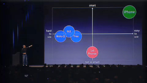
I’ve used one of these maps in a presentation before, but Steve takes it one step above by using an iPhone icon that is not only a different color than the other smart phone icons, but also a tad bit larger (please bear with me as the screen shots are a bit blurry). Although the size and color doesn’t have an actual value attributed to it, it automatically adds a second and third dimension to help differentiate the iPhone from the rest of the “similar” competition. I also like how he put all the phones on a level playing field by using the same icon and theme for all the phones instead of representing each phone with it’s respective logo. Side note: It’s funny to think how much of an impact a competitive positioning map like this can make when there are no actual values assigned to the x & y axis; you wouldn’t be able to get away with this in all presentations unless you had some supporting data and research to back up your claims – but hey it’s Steve Jobs.
Sarcasm
This slide was brilliant and so unexpected. By the way, does anyone know why sarcasm seems to be much more effective in conveying humor than other forms of humor, or is it just a personal preference? Anyway, I’ve noticed that Steve Jobs always seems to catch the audience by surprise with a laugh, which is good considering that attention spans usually run around 20 minutes max during a presentation (if you’re lucky), and most of his presentations seem to run an hour at the minimum.
Pictures

Okay, I’m cheating a little here since this slide is actually from last year’s September keynote where Jobs introduced the next generation iPod Nano and Shuffle. In this slide, Steve is explaining how 70% of automobiles being produced are iPod ready. What I like most about the slide is the way the percentage is integrated into the image itself, whereas most people would have the text and pictures adjacent to each other. Even the Chrysler 300’s shape seems to fit perfectly in the slide as an SUV would be too tall and an exotic car would be too flat and wide. I guess a Hummer, Scion xB, or Volvo might have worked as well, then again they’re not all iPod ready so there’s my answer.
In my 5 Steps to PowerPoint Presentation Enlightenment, step #1 is to watch Steve Jobs give a presentation. And I think it still holds true especially if you want to break the usual PowerPoint presentation mold that most companies and individuals have conformed to. I know that Steve Jobs spends a lot of time getting his presentations just right, but a good presentation can only help your cause especially if you’re plugging your idea or business concept.
Anyway, I hope this post at least gets you thinking about ways you can enhance your PowerPoint presentations, and if you haven’t had a chance to check out my post about presentation tips, here’s the link:
As always, feel free to leave a question or a comment!
Sincerely,
The Closet Entrepreneur
» This entry was filed under Presentations and tagged with: Advice, keynote, powerpoint, Presentations
2 Comments
Kate Brisbane
Wow that x/y axis graph is a vicious little marketing tool.
Dec 2nd, 2010
Leave a Comment