April Entrepreneur of the Month!
 You may be wondering why I’m bringing you April’s Entrepreneur of the Month on May 1st. In a nutshell, the interview with Ward Andrews, a.k.a. Mister Shape, has been painstakingly edited and revised – an attribute that lies at the very heart of Mister Shape’s business and design philosophy. So without further delay, I bring you April’s Entrepreneur of the Month, Mister Shape. Enjoy!
In the beginning, there was Wite-Out
In Junior High, yearbook class introduced me to art, photography, design and manual labor! On the yearbook staff, you wrote a story, took the pictures, edited the copy and then typed it out on your typewriter on a 4-layer carbon copy sheet. If you made a mistake, you had to Wite-Out 4 carbon copies to fix it. The layout was drawn on similar carbon layered sheets. This layout and copy was then physically mailed to the yearbook company where they would typeset it, place artwork and photos based on your drawn layout. Weeks later the company sent back proofs and then you would edit those with a pen, send it back, and they sent you another proof. That was the process of designing and producing a yearbook.
In High School, there was still Wite-Out
We had design camp for yearbook; I learned a lot of the design basics of layout and typography there. They taught a `right way’ and a `wrong way’, so we kind of became these `design snobs’ when looking at other yearbooks. It’s funny, I think some of my work today would have been frowned upon in those ‘right, wrong’ design sessions! At that time, we were just getting into using a computer but only to set the type, the rest was still on the 4-layer pica-based layouts and the photos were never scanned but cropped with a grease pencil, so I had a lot of experience doing layouts and building artwork really slowly by today’s standards. Now you can lay something out, print it out, and that’s what it will really look like. Back then it was a 2-month process to see your finished layout the way it would actually look.
In College, yes – there was still Wite-Out
I went to the University of Arizona in Tucson. They ask you to go through all the foundational art classes. You take art history, illustration, painting, sculpture, fibers, drawing, and then you get to design. And when you get to design, you didn’t go to the computer – you had to do stuff by hand. A lot of cut paper, hand inking of letters, rubbing on lettraset type, ordering chromatechs, rendering thousands of thumbnail sketches. It was great training. There was time to think through your concept and really have a great idea before the laborious task of executing it. What I see today is instant gratification on the computer. Anyone can type out or paste in what they want and it looks decent technically so there’s a temptation to leave it and say it’s done. Usually, it’s not. The type isn’t letter spaced perfectly, the curves from your pen tool aren’t exact, and the style you achieve is based on the computer’s default settings. It’s awfully easy to let the computer drive the aesthetic. In the end that’s letting your tool (the computer) control your art. You want to be an artist and an author first, and have that idea down, then determine a tool and execute your idea.
The first design class…
I had a professor say “Take out your sketch pads and do one-hundred thumbnail sketches of different logos for this project.” So I did a hundred thumbnails, came back the next class, and he said “Okay, do a hundred more – throw those away and do a hundred more.” Looking back that was great, the lesson was that you need to go through a lot of iterations and you have to think about it and you can’t hold on to your first idea and think it’s precious. The creative process is often an interactive one, so learning to let go of the first idea (so that you have access to the 20th one, the perfect one) is a great benefit.
The moniker takes ‘shape’
In Tucson, I worked for my professor Jackson Boelts and his brother Eric. One afternoon, Eric peeked over my shoulder as I was solving a layout problem with a series of shapes and said, “You’re Mister Shape.” And so that name kind of stuck. One of the first pieces that inspired me was the design of a magazine called Emigre. I found an issue that had been authored by designers in the UK called The Designers Republic. The message was all from the designer. The style was very distinctive and unique. At that time the style was predominately shaped based, and much of it was tied in with the electronic music coming out of Europe. In this work, the forms were carrying the vibe of the music, and that was a large influence on my design work in school and it’s carried over in the Mister Shape work.
The shirt off your back…
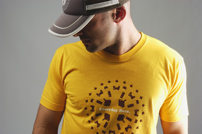
I have always loved T-shirts, it’s something where a cool idea becomes a product and other people can enjoy it too. I like the idea that I can design and produce something that has value to people and makes them happy.
Mister Shape’s inspiration…
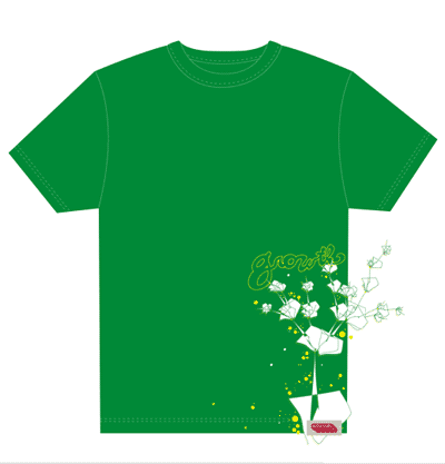
Series 1 was all about growing up in the suburban desert. It was this idea where there was a lot of concrete, it was hot, and there were swimming pools, fans, ice cold drinks and squirt guns.
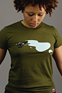
| The Poolhopper: And so the whole idea was as a kid, we were always hopping fences, jumping in pools, going to the resorts and jumping in pools, and at night there was a lot of pool hopping going on. With these 3D renderings of the shapes of pools, it just turned into a great shirt. I think it would be a nice poster. | The Soaker: I really like the Soaker for a lot of reasons. The original title was ‘Reload’ and at first glance it’s a gun and like maybe it’s a pool of blood or something – you’re not really sure what it is. I was at Six Flags and a security person stopped me and said “You’re promoting violence” and I said “I’m promoting fun”. It’s a squirt gun. So the new name, ‘Soaker’ was more friendly and hinted at the water aspect. Also, the puddle spells out “Mr.” – so I like having that hidden reference in there. Series 1 was all about growing up, staying cool and having fun. |
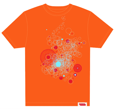
Series 2 is a couple of different things.
Mister Shape’s business…
Mister Shape is actually an art design project. It’s an art project that happens to be a business. So I’m selling art, which happens to look, feel and wear like a T-shirt. Mister Shape also has the opportunity to collaborate with other artists, with their products and help them with design, marketing and sales.
Quality over quantity…
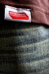
I would rather have a super high-quality product at a slightly higher price; I don’t want the brand ever associated with poor materials or poor printing. I use American Apparel even though it’s 4 times more expensive then what’s possible on the low-end, but I like the quality of the material – how soft it is, and I like that its form fitting and light-weight. Mister Shape has a large screened-in label which isn’t cheap to produce; it means every shirt has to be hand flipped inside out so that label is screened in that big. Every shirt has a woven label; it’s not a paper label or a printed label. The experience that someone has with the brand and product needs to be great, they need to have a great feeling and see all the details, its part of the experience of wearing Mister Shape.
Connecting with the customers…
I have the Shifter blog and I’ll get comments and email about my posts. I posted about the amazing Nintendo DS and some games for it and I get a ton of email about it all the time, people letting me know they’ve purchased it and love playing with it. Then there’s this one guy in Georgia who owns a pool cleaning business, and he bought the Poolhopper because that’s what they do – they hop around from pool to pool cleaning them. And so he emailed me and was interested in getting a Poolhopper for every one of his employees!
Mister Shape’s tips on starting a business…
Everyone makes starting up out to be a big deal. I think that puts too much pressure on what it really is. I think you just do it, and you do it on the side first. Start small; do a little bit here and there. Gain momentum without jumping in and facing a situation where you can’t support yourself. I think you have to have the right mind set and you have to have a lot of confidence that you can do it. I’ve always believed that a designer should be an author not a short-order chef. Designers have this great opportunity today to self-publish, to create the future. Today all you need is a great idea, as the tools and means of production are becoming very inexpensive. I realized if I wanted to have the complete creative freedom and quality control, I had to start this business to do that. Look in the design industry and many of the designers that do innovative, engaging work, that have a unique voice; they’ve started their own thing. They’re all authors and they control all aspects of their products. I’d recommend Ellen Lupton’s book, D.I.Y.: Design It Yourself, which touches on a lot of these ideas, and provides a lot of examples and bios of designers taking on their own product design.
For any entrepreneur, my advice is to use all of those great web tools that are out there that are practically free. When I sell my shirts, I don’t have a merchant account I just have PayPal. When someone buys a shirt, then that’s when I pay a transaction fee. They provide all the systems – you can track shipping and you can print shipping labels. For my email campaigns, there’s no reason to build a custom email system, collect emails manually, and then try to send out emails. I use Campaign Monitor; you only pay when you send out an email. I send out infrequent emails, only 2 or 3 a year, and so I only pay when I send them out, yet the service allows me to store and manage my email list for free. I use Blogger for the Mister Shape Shifter Blog. Blogger’s 100% free, it’s simple and easy to use. So take advantage of the free tools that are available to you.
The future of Mister Shape…
 Regarding ‘the future’, I like to be really flexible; I always try to keep the focus to the next six months. When you look beyond that time horizon, the world will have changed significantly and you don’t want to be trapped in an old plan that no longer applies. I change methodology and delivery tactics a lot, though the greater goal of creating great design and experiences and telling stories stays the same. Think about our lives and experiences and how they change so fast. Technology, for example, is changing at a rate that we don’t know what the new opportunities are going to be in 6 months, yet as they come, I want to turn on a dime and be able to do different things.
So in the next 6 months, Mister Shape could go in a dual track where the shirts appear in larger retail stores, but then there’s also the more exclusive limited edition line that you would find in the small boutiques and online. It looks like Mister Shape will provide more than shirts in the future. Mister Shape will collaborate with other artists and create other things. It’s all about creating art, solving problems and having fun. The profit will come because people want real, authentic, great products that matter – products that mean something. At Mister Shape it’s not about looking at the `market’ and trying to `capture the market’, it’s just about the design conversation I can have with my customers, my friends, what problems can be solved, what experiences can be created, and what are we are all into and how Mister Shape shares in that.
–Ward Andrews
Founder of Mister Shape
» This entry was filed under Case Studies and tagged with: Advice, Interviews, startup



3 Comments
Ward Andrews
Tomas, thanks for the nice write-up…
Jun 2nd, 2006
TOMAS
It should be I thanking you for taking the time out to do an interview!
Jun 3rd, 2006
SReth
This is fabulous serendipity. I was searching San Manuel for info and found you. Wonderful site! Have sent it to 3 of my friends, one who said: “Grrreat! I spent about an hour reading various links from that one ref!” and posted to Facebook. Will come back regularly. Thank you.
May 10th, 2011
Leave a Comment