Reverse Engineering the Ultimate TEDTalk
Due to my involvement with TEDxPhoenix, I was given the opportunity to attend TEDActive 2010 and witness a great talk by Sebastian Wernicke entitled Lies, damned lies and statistics (about TEDTalks). Not only was his delivery spot on, but his slides were very well designed and had a custom feel that set them apart from many presentations I’ve seen.
Sebastian was kind enough to share his presentation tips with me, so I thought I would post them here for all to enjoy. Who knows, maybe someone will be inspired to create their own ultimate (or worst) TEDTalk and find themselves on the front page of TED.com like Sebastian did.
Lies, damned lies and statistics (about TEDTalks)
For starters, here is Sebastian’s TEDTalk for those of you who have yet to see it. It’s only six minutes long, so I highly recommend watching it now.
(Click Here if you can’t see the video)
Presentation Software and Design…
Sebastian used PowerPoint for his presentation software, and took the time to create his own theme and color palette based off the “pen-on-paper” look he was going for.
The font is a commercial font from Linotype called Linotype Feltpen — it’s not a free font but he was willing to pay extra for something unique.
Custom Drawings…
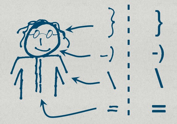
According to Sebastian, all the graphics were done in PowerPoint and took a lot of time and energy to create. Take for example the following “drawing” — the figurine isn’t actually a drawing at all, but instead it’s a combination of free-form shapes and Linotype Feltpen font characters:

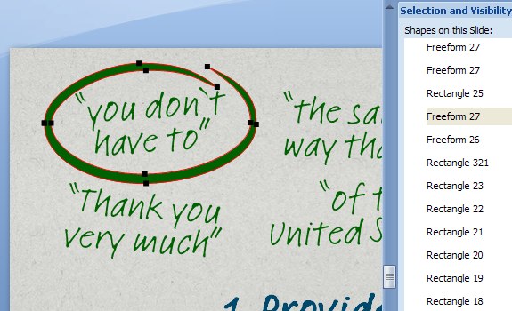
More free form shapes are found throughout the presentation including arrows, arcs, and highlighting circles that are reminiscent of the old Intel logo.

Slide Transitions and Animations…
Unfortunately not all animations are shown in the video, but you can catch a few of them when the camera shows Sebastian and his slides on stage. Sebastian used a variety of fades, slide pushes, and motion paths to fit large drawings and oversized content onto a single slide.
I’ve embedded an example where a push transition is used to introduce the slide, and is followed by motion paths to introduce the various parts of the chart. If the Quicktime animation fails to show below, then you can download the Quicktime file to view it: Slide_Animation.mov (~400Kb in size)
Preparation and Advice…
Sebastian spent four hours and 10-20 iterations to get the slides and story to their final form, and an additional four hours were spent practicing the final version. In total, eight hours were spent to get the delivery just right which is pretty incredible for a six minute talk.
Although Sebastian didn’t consult any particular resources for this presentation, he does follow Presentation Zen and has read Slideology for inspiration and advice.
As for his own advice, Sebastian offers this tip:
Be ready to ruthlessly remove anything from the presentation which doesn’t serve its purpose. This is much harder than it might sound, especially if you think it is a nice idea or something you are passionate about.
In Conclusion…
As always I hope this information is useful, and I hope it inspires you to take your presentation to the next level. Last but not least, here’s the TEDPad that Sebastian developed just in case you want to take a shot at creating the ultimate or worst TEDTalk possible.
Sincerely,
The Closet Entrepreneur
» This entry was filed under Presentations


One Comment
Amir Anzur
These are very innovative methods for developing creative ideas. TED is really helpful and motivating and also provides a sense of inspiration. Tips are highly useful. Thanks.
Sep 2nd, 2010
Leave a Comment