How To Add a Vertical Line to an Excel XY Chart
Normally, one turns to the line tool in Excel to manually draw vertical lines on a chart. The issue is that these lines aren’t bound to the x-axis, so any change to the chart is usually accompanied by manual line repositioning. Thankfully, there’s a “hack” that can eliminate the hassle of drawing vertical lines while allowing you to instantly change their position with a few mouse clicks.
Step 1: Create an XY (Scatter) chart…
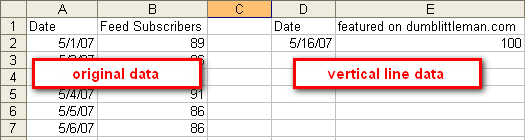
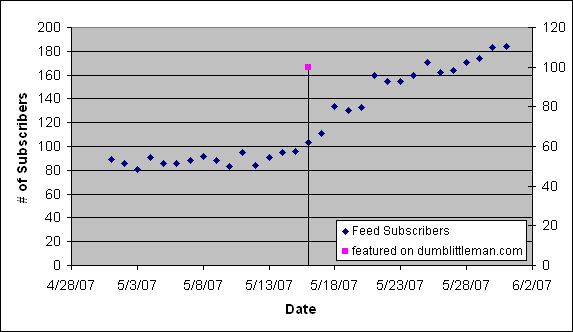
For this example, theclosetentrepreneur.com feed subscribers for the month of May is being used.
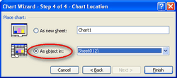 Using the Chart Wizard, create an XY (Scatter) chart with time on the x-axis and your numeric data on the y-axis. If you want to follow the example in this tutorial, you can download the Excel spreadsheet *HERE*. Be sure to follow all the Chart Wizard steps and choose the “as object in” option to place the chart in your worksheet (we can change the location of the chart later).
Step 2: Add the vertical line data to your chart…
In a separate area on your worksheet, add the info for the vertical line data. Be sure to follow the same data structure that you used for your original data. For this example, the date when theclosetentrepreneur.com was featured on dumblittleman.com is being used as the vertical line data. It doesn’t matter what you name your y-axis data (you will see why “featured on dumblittleman.com” is being used in a moment) or what value you use as long as it is in the neighborhood of the data that has been plotted.
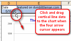
Once you’ve entered your vertical line data, select it and place your mouse over the select border until you see the “four arrow” cursor appear. At this point, click the selected data and drag it to your chart.
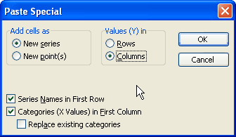
A “Paste Special” dialog box will appear, be sure that the options match those shown in the picture below:
Step 3: “Hacking” the error bars to create a vertical line…
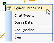 After dropping the vertical line data in your chart, you should see a singe point appear representing your vertical line data. Click on the data point once to select it, then right click on the data point and choose “Format Data Series…”. In the “Format Data Series…” dialog box, click the “Axis” tab and select “Secondary axis”. Then click on the “Y Error Bars” tab and select the “Minus” option under Display. Change the error amount to percentage and enter 100% for the value. Click “OK” and your data point will now appear on a secondary axis with a vertical line underneath it which was created by the “minus” y-error bar. Changing the date and value of the vertical line data will move the line around as you wish, and the vertical line will remain in place when resizing or adding more data to the chart.
Tips on formatting your chart…
You’re basically done at this point and although this technique for adding a vertical line is useful, it’s not easy on the eyes. So to improve the appearance of your chart, you can format the vertical bar by clicking on it once to select it, then right clicking on the bar and selecting “Format Error Bars…” and click the “Patterns” tab to change the look of the error bar as you wish.
In addition, you can hide the secondary axis by clicking on it once to select it, then right clicking the secondary axis and select “Format Axis…”. Choose the “Patterns” tab and you can choose “None” for all the line and tick mark labels to hide the axis on the chart. In addition, you can change the scale of the axis to expand or contract the vertical line as you wish.
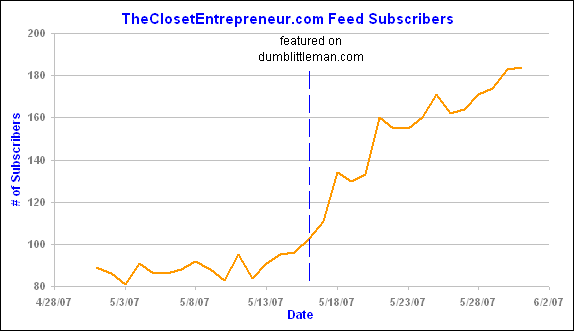
And last but not least, you can access the “Format Data Series” dialog box for the single vertical line data point (as was discussed above) and add the y-axis column label to your line by selecting the “Data Labels” tab and checking “Series name” under the Data Labels section. In this example, doing so will add “featured on dumblittleman.com” to our line. With a little additional formatting, you can end up with something like this:
In conclusion…
This technique may seem like a lot of work, yet it’s easy to get the hang of once you’ve done it yourself. Plus, you can change the chart any way you like and not have to worry about manually moving vertical drawn lines around to compensate for any changes. Also, the vertical line location is accurately displayed, which isn’t necessarily the case with a manually inserted line. Ultimately, there are numerous ways to insert vertical lines into an Excel chart and hopefully this technique gives you a different perspective on the process. If you have any questions or suggestions, feel free to leave a comment below!
Sincerely,
The Closet Entrepreneur
» This entry was filed under Excel and tagged with: Advice, Excel, tutorial
70 Comments
Suzie
Could you send me the sample worksheet with two vertical lines, which you mentioned above? Every time I try to repeat the instructions for the first line (which works), nothing new appears anywhere. Thanks
Nov 1st, 2010
Judy
Hi,
I am not sure if anyone can help me on this. If my x axis value(eg. date) is layouted horizontally in the spreadsheet instead vertically in the tutorial. Is the method still useable?
Thanks.
Date 01/11/10 02/11/10 03/11/10 04/11/10
Value 25 75 13 7
Nov 30th, 2010
Kevin
I agree, this informatin is great, and this process works perfectly for office 2003, however in 2007 this funtion doesn’t seem to work. Has anyone identified a work-a-round?
Thanks!
Jan 4th, 2011
Cristiano
@ Kevin
Have a look at my suggestion from March 22nd, 2008 above (look for Cristiano) and see if it works in Excel 2007. Hope it does.
Jan 24th, 2011
Krzysiek
Same here, Excel 2011 does not support this feature.
Jan 27th, 2011
johnq
Hi,
I have a couple of questions. Hope you don’t mind answering.
1) as I drag the ‘vertical line data’ to the chart (plot area), the ‘Paste Special’ dialog won’t show. Instead, the data will hide behind the chart and nothing happens. Is your Excel a version of 2007?
2) can you do the same thing (a vertical line) on a Pivot Chart?
Thanks a lot in advance.
JohnQ
Jan 31st, 2011
sh0s
this works in office 2007, just add a new series with the one point.
Mar 4th, 2011
Rebecca
Three years after your post this is still helping people – great tip, and with some tweaks worked perfectly in Excel 2011 for the Mac!
Mar 13th, 2011
Patrick Millner
Thanks, this is a neat trick but I need to take it a step further. Now that I have my vertical line I would like to shade the area of the chart to the left of the line. Do you have any tips for doing this?
Many thanks.
Jun 8th, 2011
Homes
Actually this is how its done: http://peltiertech.com/Excel/Charts/AddLineHorzSeries.html
Aug 24th, 2011
Jordan
Hi, thanks for posting!
My problem with using Scatterplots is formatting the x-axis. It won’t let me format it as dates, so I have to convert to numbers which is fine except that the intervals are all screwy when leap years hit
For example, my axis says 1/6/2006, 1/6/2007, 1/5/2008…which just looks bad. Any suggestions?
Oct 3rd, 2011
Jordan
Hi, thanks for posting!
My problem with using Scatterplots is formatting the x-axis. It won\’t let me format it as dates, so I have to convert to numbers which is fine except that the intervals are all screwy when leap years hit
For example, my axis says 1/6/2006, 1/6/2007, 1/5/2008…which just looks bad. Any suggestions?
Oct 3rd, 2011
Guadelupe
Hi, I have used this from the website you provided (www.peltiertech.com). It works great. Only thing if I want to show the data table it will not work. I have tried other options before but there the additional data will also show on the data table. Does this mean that it is not possible?
Regards, Guadelupe
Nov 16th, 2011
Tony
@Rebecca
Hey I got excel 2011 for Mac and the vertical line is just not working for me…as I insert for the X axis for the second serie the X axis for first series follow changes as well! Do you have any tips for this one?
Much appreciated!
Tony
Dec 20th, 2011
Tony
Hey again, just figured it out how to do that, but the problem is remains as fact that the vertical line always at the starting point of the X axis while what I want is to put it in the middle of the graph. doesn’t matter what date I insert it always shows up wrong!
Thank you for all help!
Dec 20th, 2011
Eole
It is almost 5 years now that you posted this article and it is still very useful. I just used it and it worked like a charm with Excel 2010. Thanks a lot-
Jan 27th, 2012
Erik
That’s great. I wasn’t able to figure out the error bar method in 2010, but was able to get a trendline to run vertical which was the object of the excersize.
Feb 16th, 2012
shawn
i find this absurd. i have a graph that is simply graphing percent accomplished per day and i want a vertical line between a particular Wednesday and Thursday. this method does not allow me to do that.
Apr 9th, 2012
shawn
I want to add that the easiest way to put a line on a chart– especially when the X and Y axis are not based on standard dates or what not– is to copy and past the Excel chart in PowerPoint and just draw the line in that. It is the easiest way to do it for Trial-by-Trial ABA charts or various behaviour datatracking charts of that kind.
Apr 9th, 2012
Leave a Comment